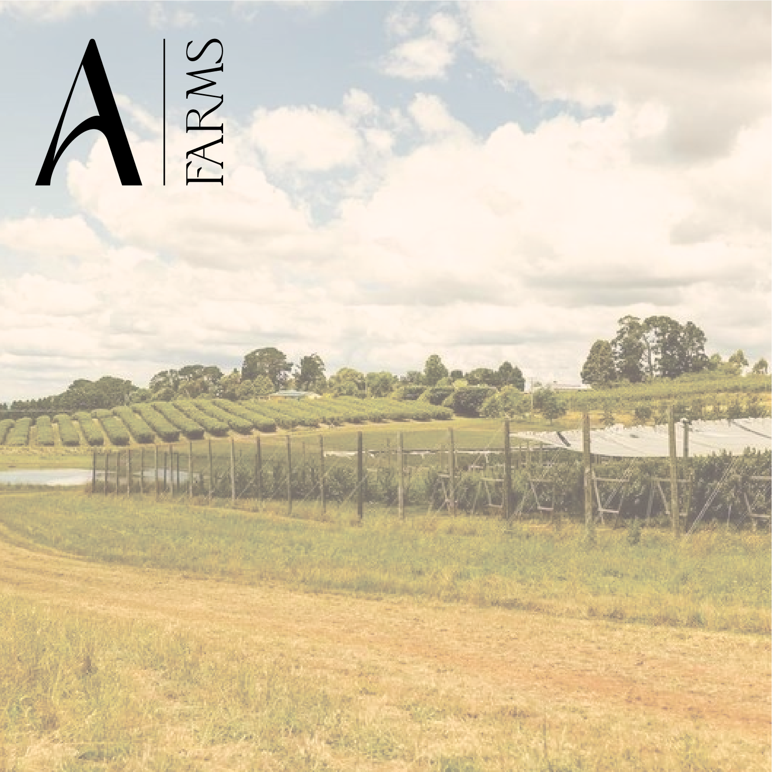
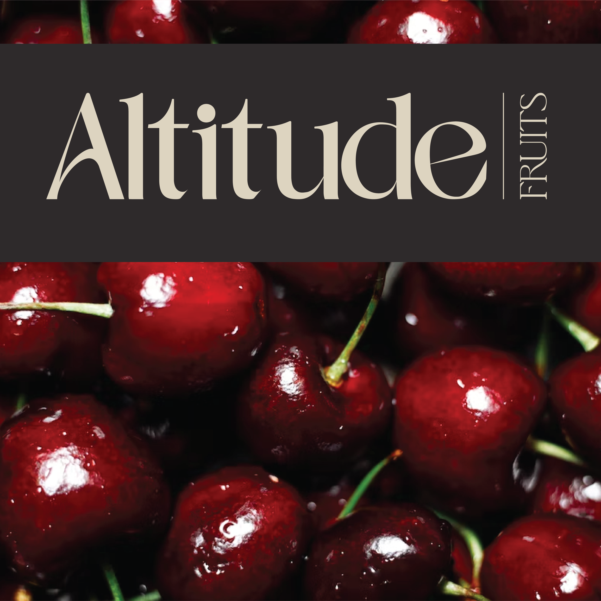
ALTITUDE FARMS / ALTITUDE FRUITS
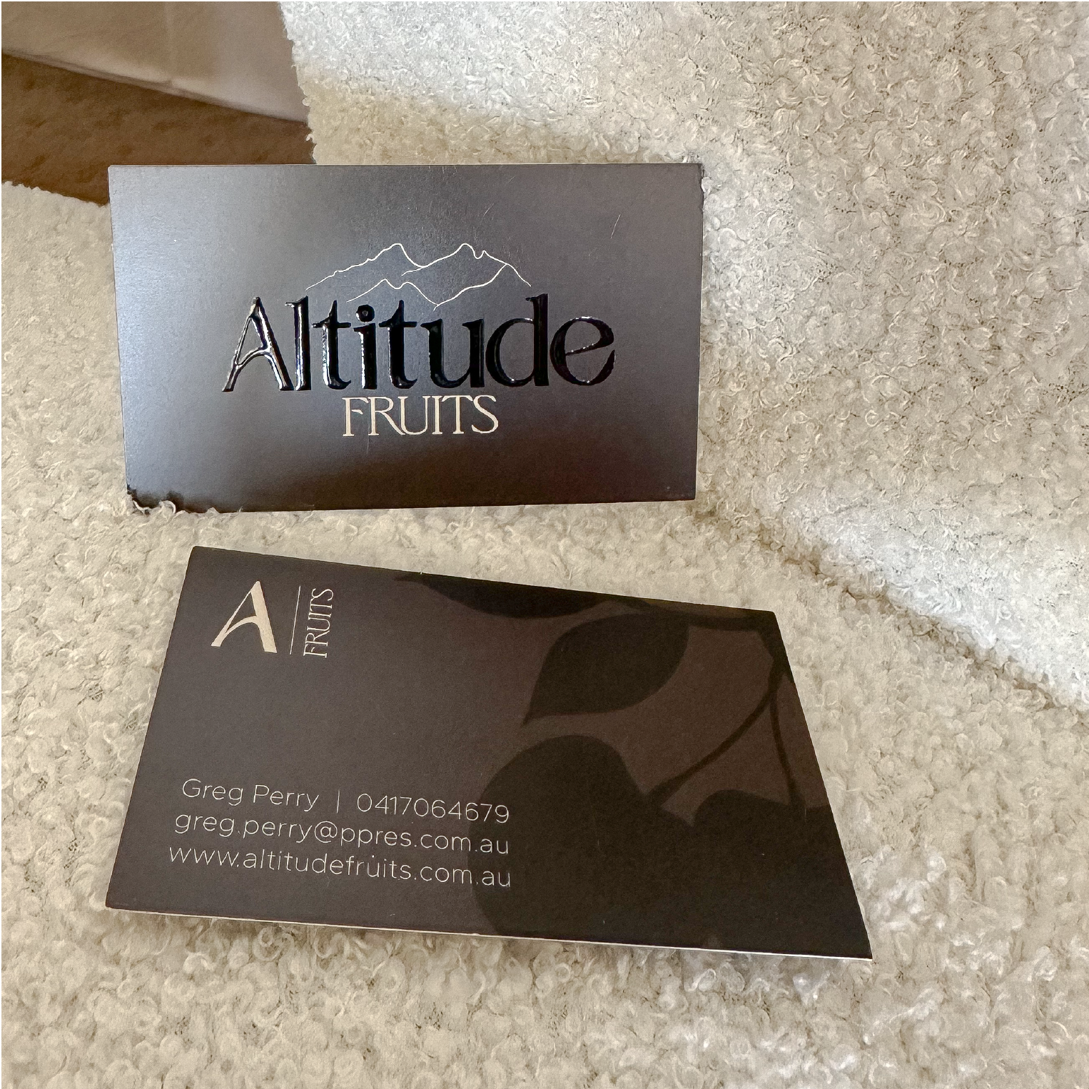
With sustainable farming practices & high-quality produce at the forefront, we wanted to reflect this within the brand identity. I used a sophisticated sans serif font within the logo suite, accompanied by a finer luxury typeface, with fine lines reflected above the primary logo to represent Altitude. I applied spot UV to the business cards to add extra class.
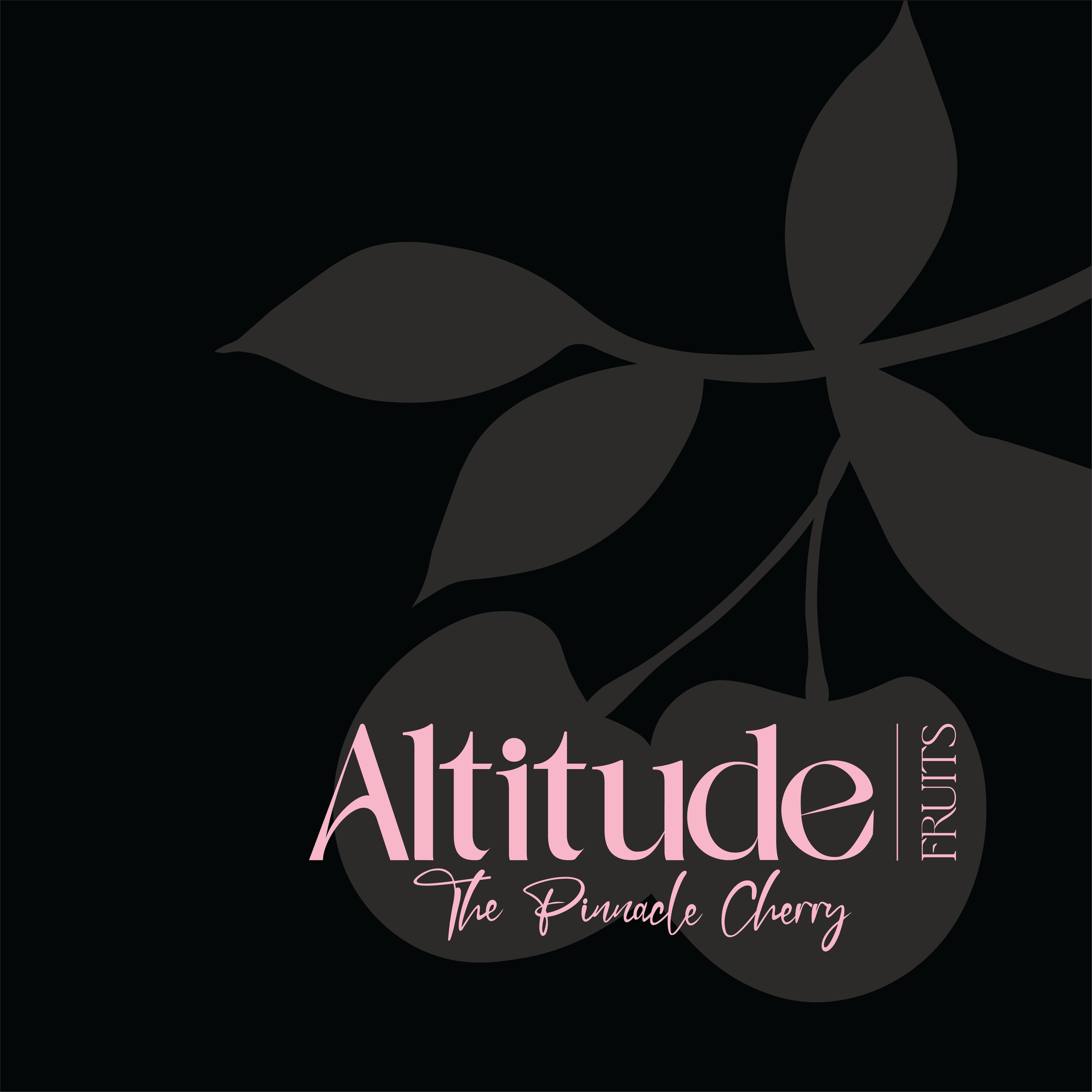
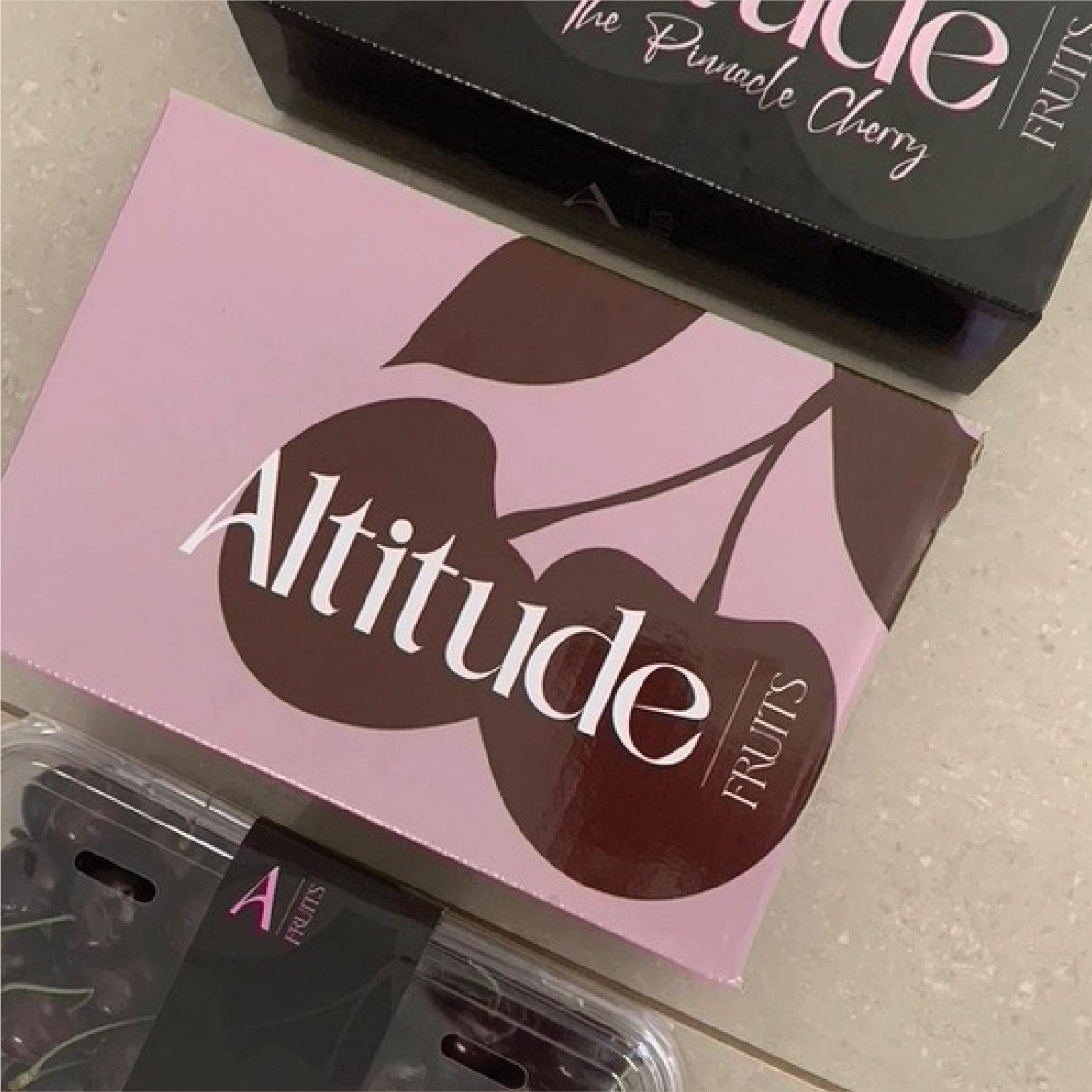
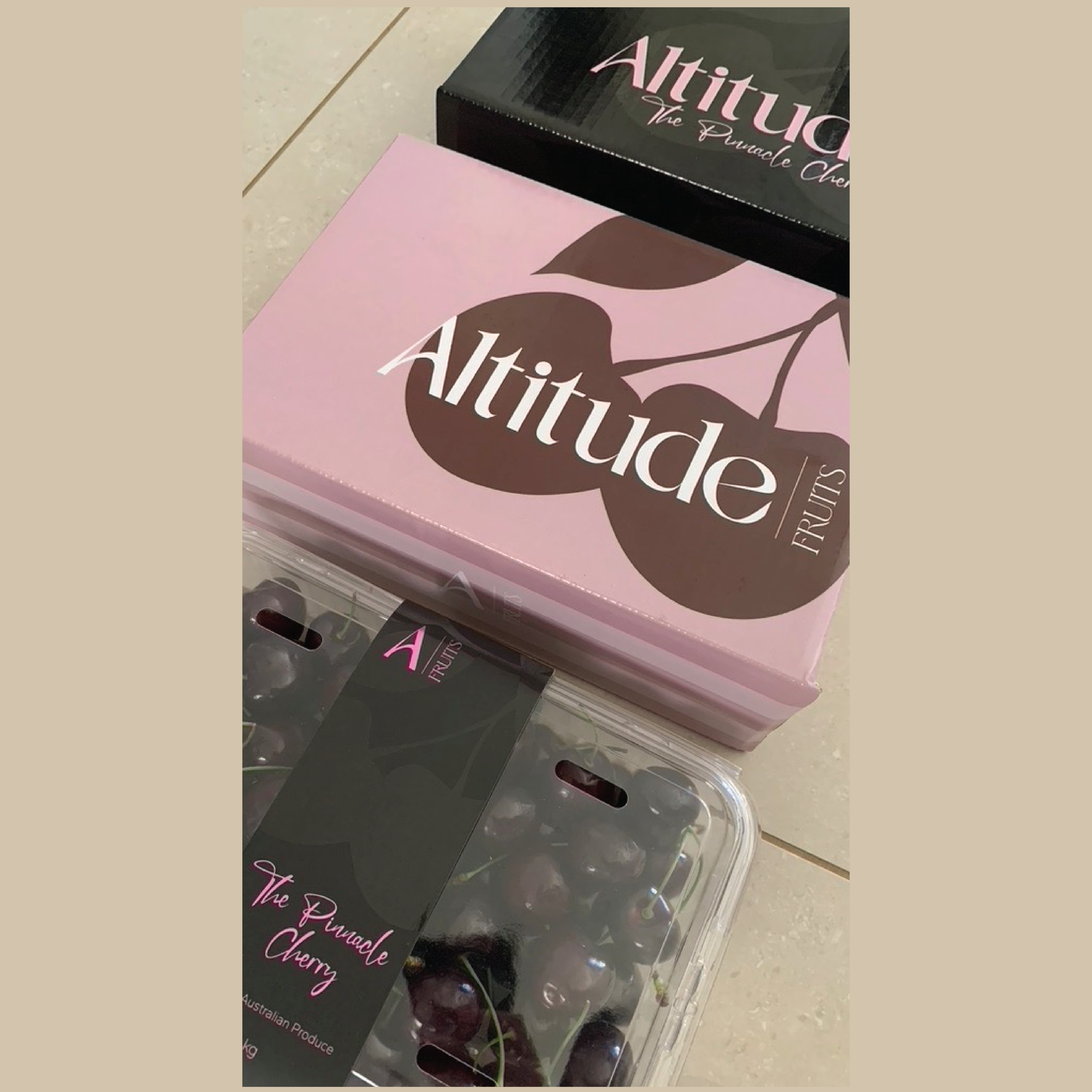
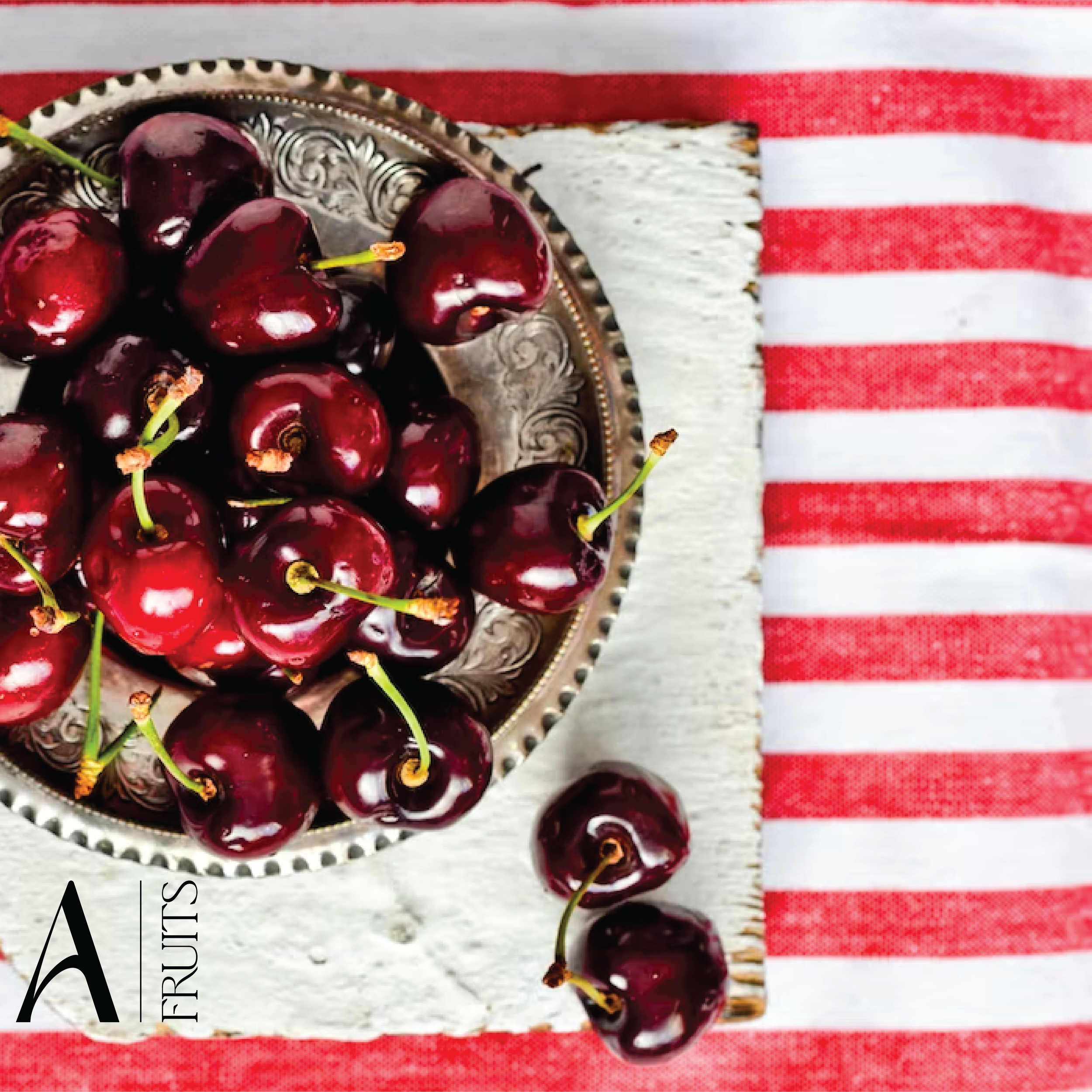
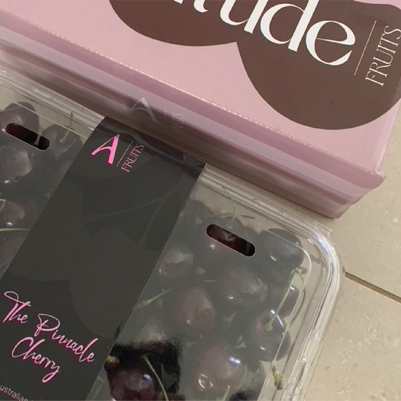
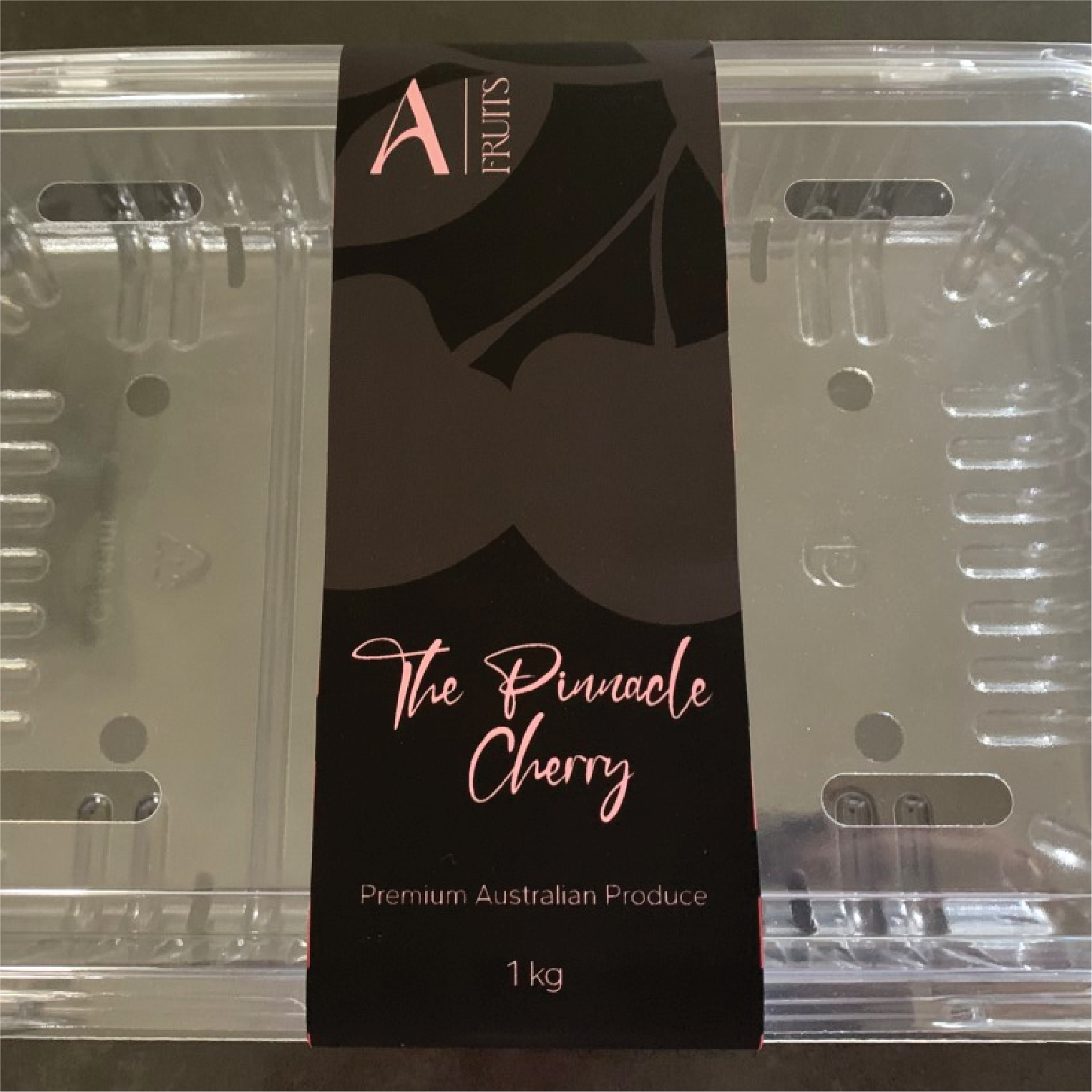
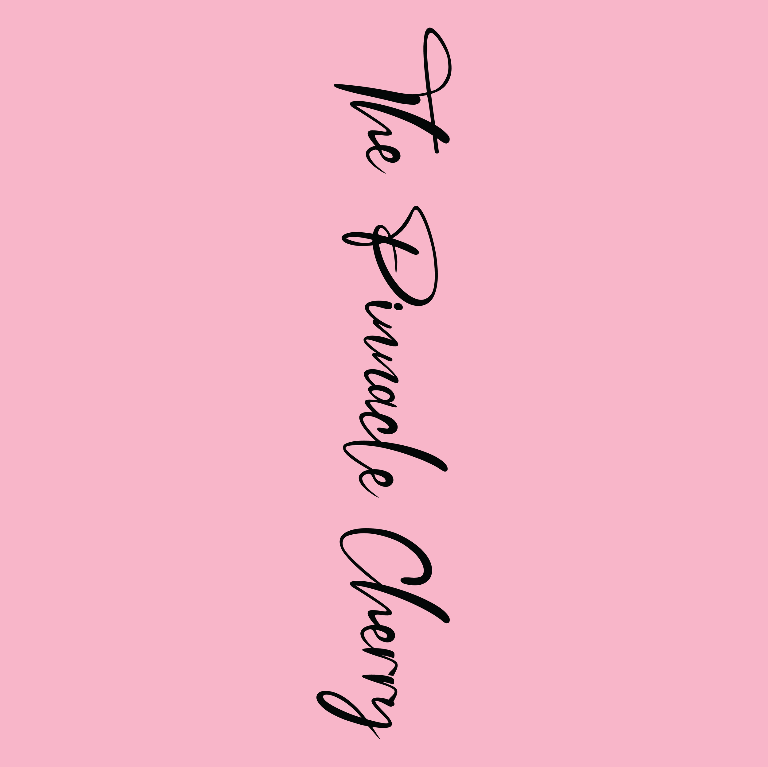
The packaging was strategically designed to stand out in a competitive market, printed on premium stock, using a colour palette that is both sophisticated and fun. The cherry illustration extends down the sides of the box to add a 3D feel, whilst ‘The Pinnacle Cherry’ was designed in a contrasting handwritten font, to highlight the quality within their fruit.


The punnet label was designed and printed using both spot UV and bright pink foiling, to stand out, attract Altitude’s demographic and represent the high quality cherries.