What started as a stationery refresh quickly evolved into something more.
It became clear early on that the existing brand no longer reflected the level of care or the experience Jade was providing. So we took a step back and reworked the identity as a whole.
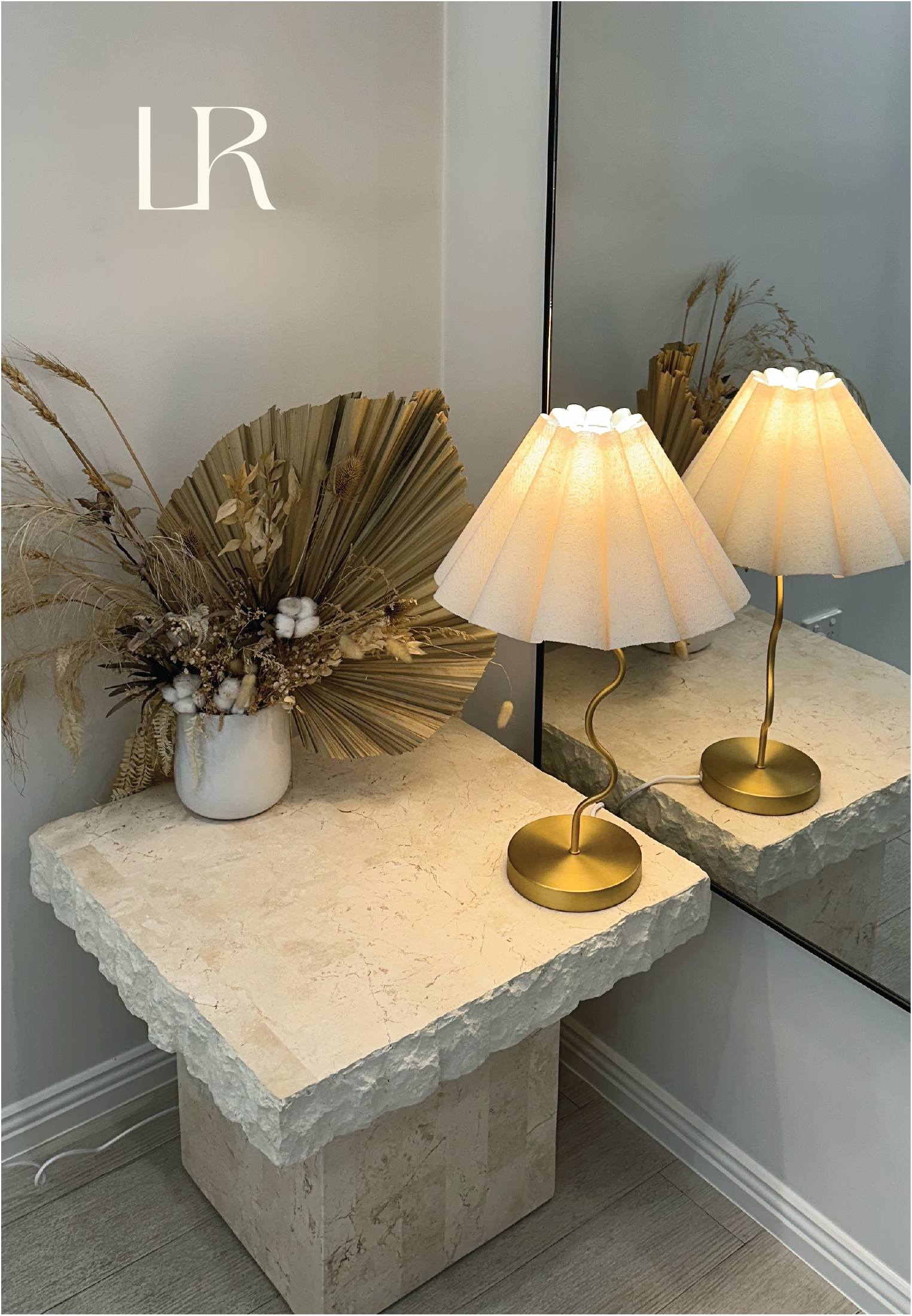
The focus was on capturing that sense of calm and ease, while still elevating the brand to match her skill and professionalism. Every detail was designed to feel soft, cohesive and intentional; from the visual identity through to the stationery pieces.
The result is a brand that feels aligned, not just visually, but in the way it represents her business as a whole.


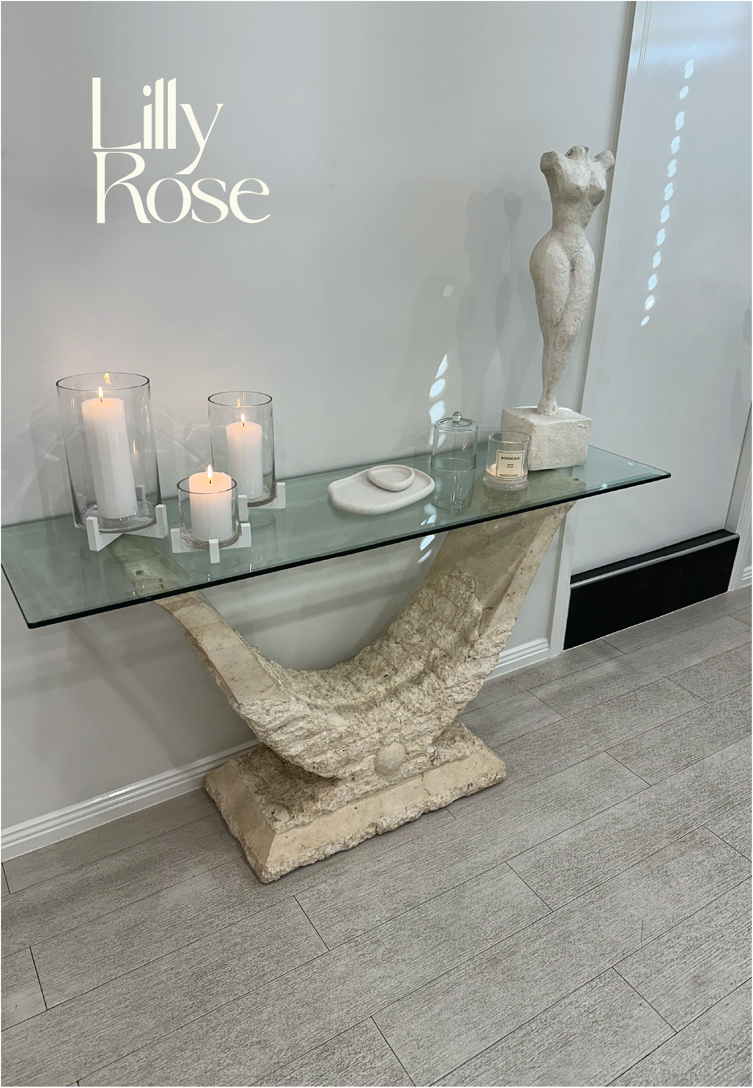
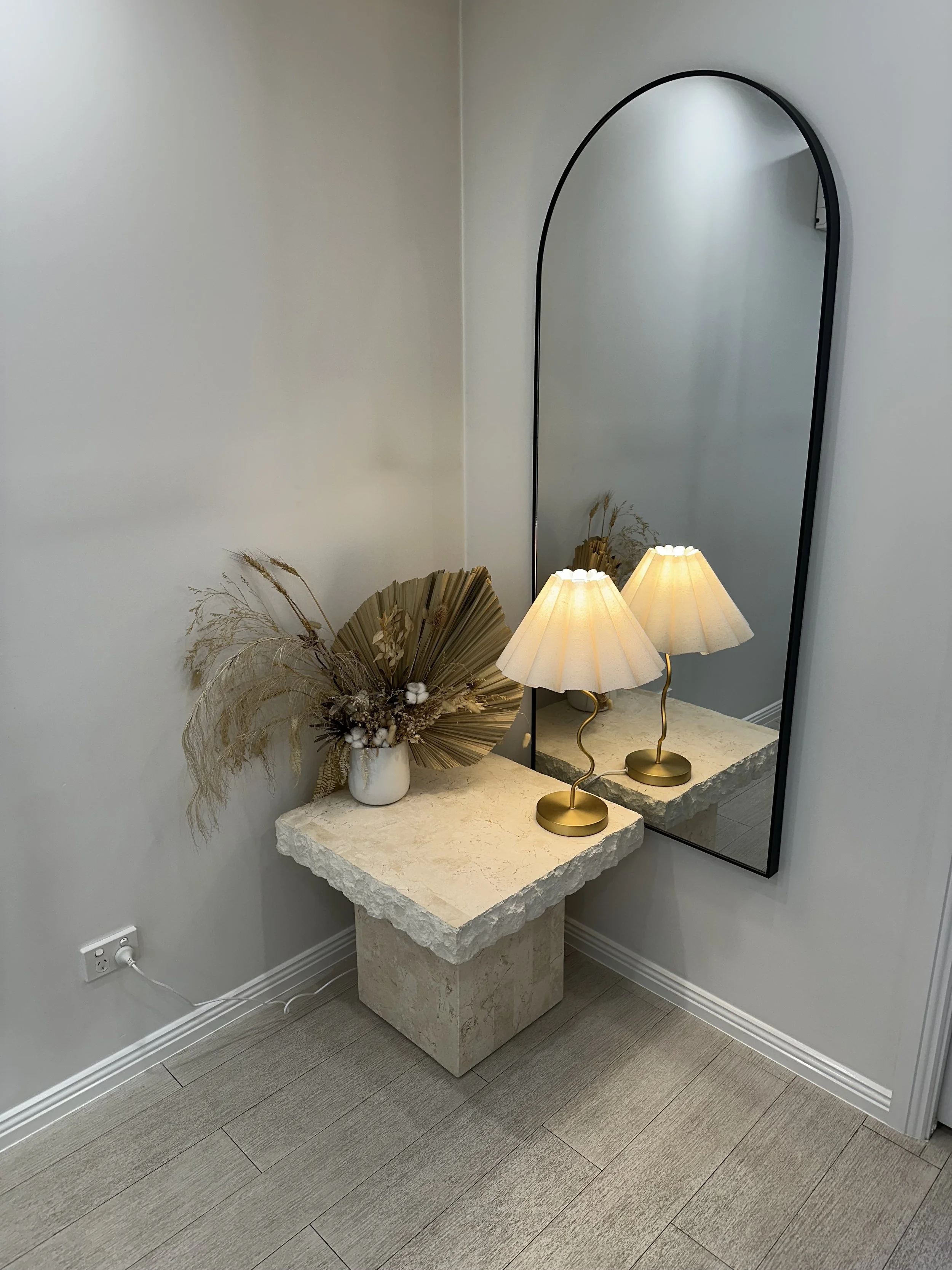
LillyRose Beauty is centred around creating a calm, welcoming experience.
Led by Jade, the brand reflects a quiet confidence, where skill, care and attention to detail come together. It’s not just about the service itself, but how people feel while they’re there.
Soft, considered and refined, every part of the brand mirrors the environment she’s created for her clients.

The final identity feels like a true reflection of LillyRose Beauty.
It’s calm, elevated and cohesive; bringing a sense of consistency across every touchpoint. The stationery now feels like an extension of the brand, rather than a separate piece.
Most importantly, it supports the experience Jade creates for her clients; thoughtful, considered and effortlessly professional.