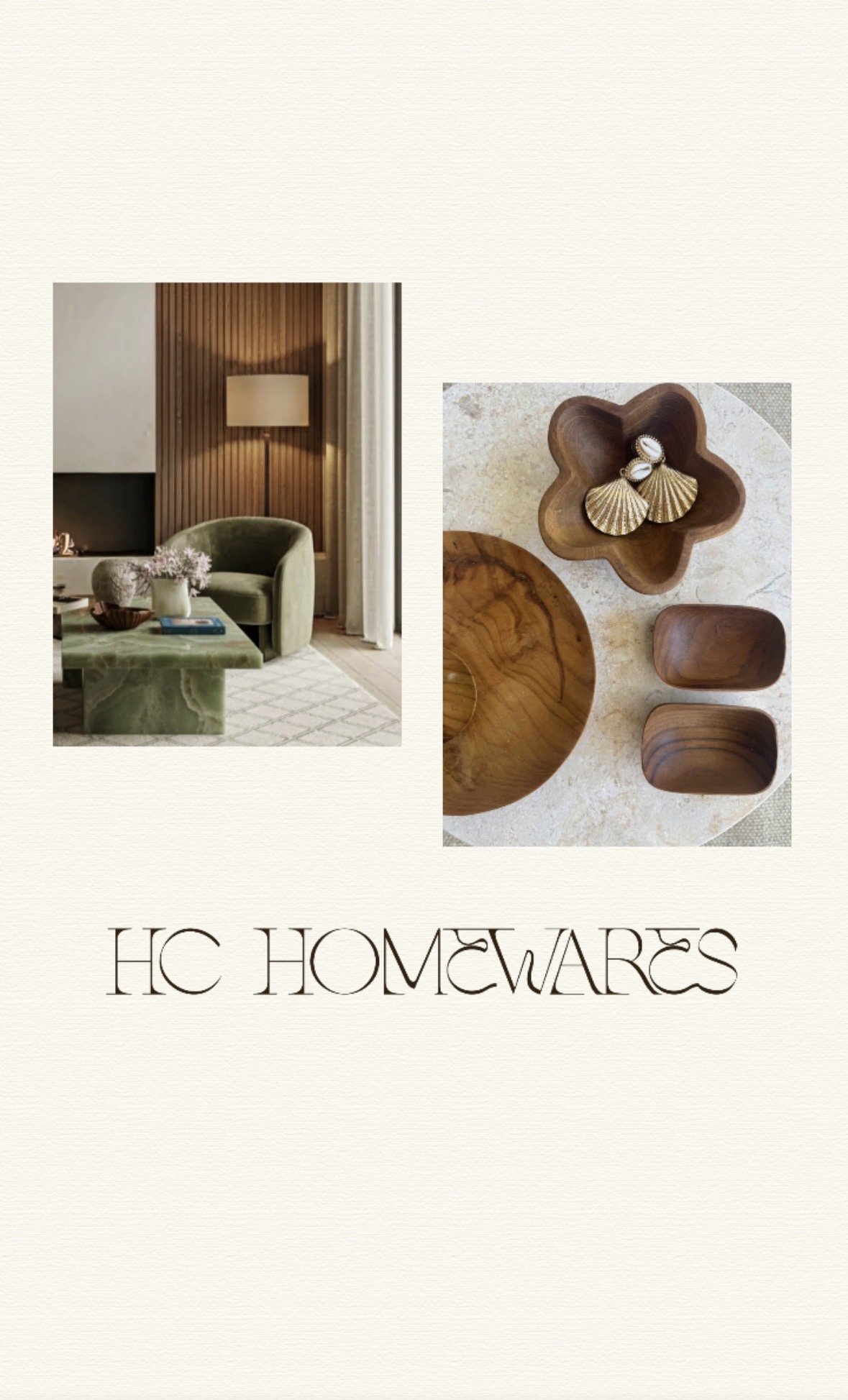
The direction for HC Homewares was to create a brand that felt elevated, while still grounded in the natural materials at the heart of the product range.
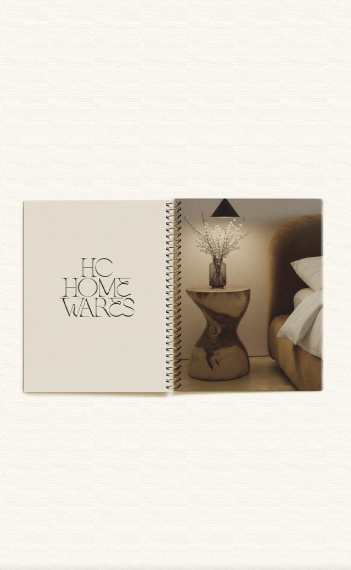
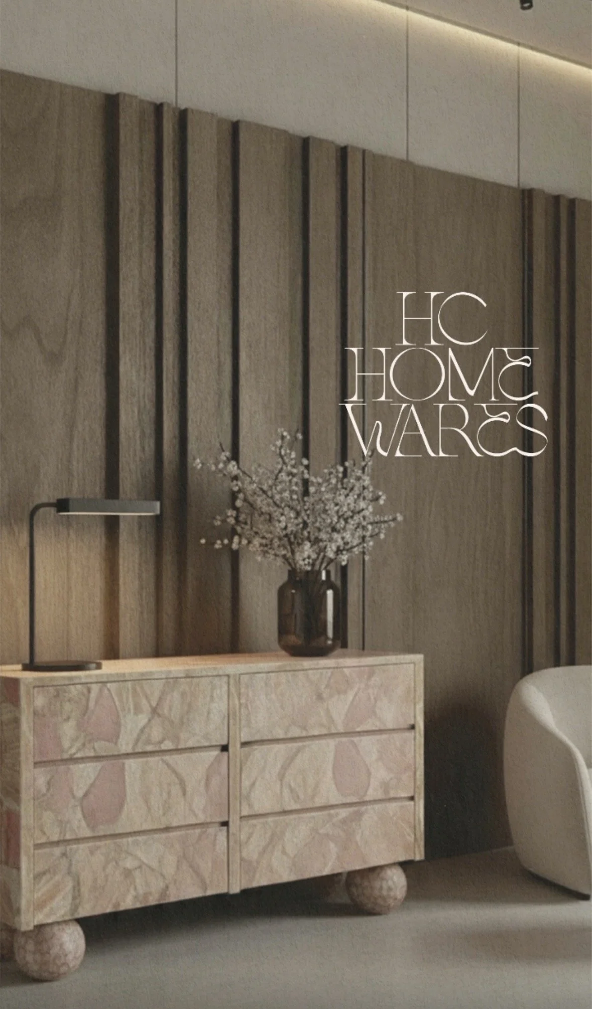
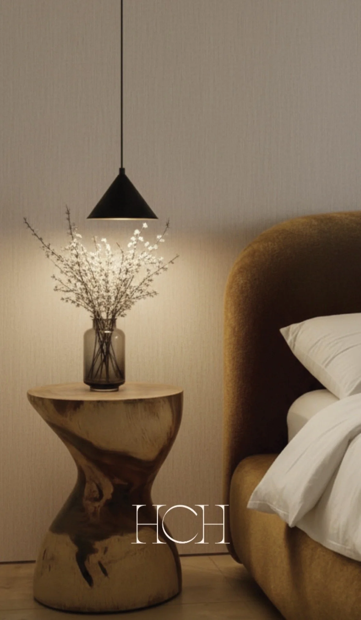
The logo suite was designed to complement the pieces themselves; refined all-caps typography that feels modern, clean and quietly confident. It brings a sense of structure and sophistication without overpowering the brand.
From there, the focus shifted to building a cohesive identity. An earthy colour palette was chosen to reflect the natural origins of the materials, adding warmth and depth while keeping the overall feel minimal and considered.
Every element was designed to work together, creating a brand that feels balanced, distinctive and easy to recognise.
HC Homewares is a brand built on the idea that luxury should feel personal.
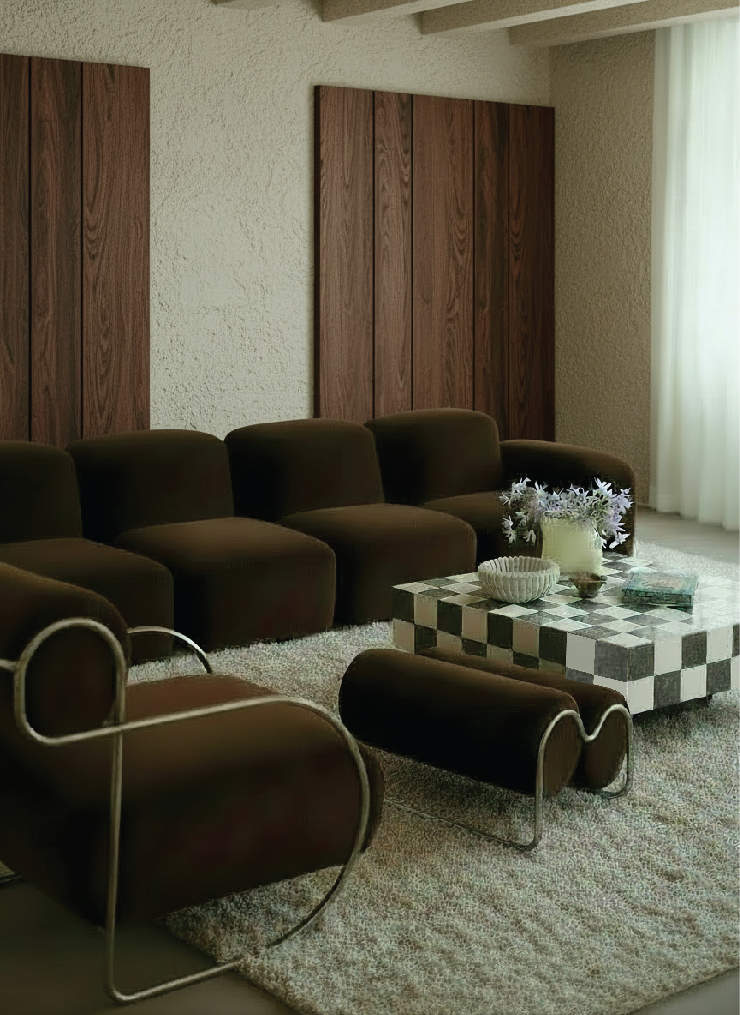
Centred around beautifully crafted pieces made from natural materials, the collection is designed to be mixed, layered and lived with. Nothing feels overly styled or fixed, each piece is created to work together while still allowing space for individuality.
There’s a quiet confidence to the brand. It’s considered and refined, but never rigid, focused on creating homewares that feel timeless, tactile and effortlessly part of the home.
The final result is a brand identity that feels aligned with the product and the experience it offers.
The free form type is refined without feeling overworked and modern without losing its warmth. The balance of clean typography and natural tones creates a sense of understated luxury that supports the collection without competing with it.
Most importantly, it gives HC Homewares a strong, flexible foundation, one that can evolve with the range while continuing to feel cohesive, elevated and true to its essence.